Getting started with TailwindCSS as a CSS newbie who doesn't know UI design
Yes, it is possible to create a professional-like design using Tailwind even if you're new to this world

In 2 weeks, I was able to go from knowing nothing about Tailwind and very little about CSS to fully implementing it in all the views of my Rails application. Here’s a glimpse of what my application looks like now:


The reason why I’m showing it to you is to paint you a picture of what you can build for your app as well - even if you’re a newbie to design and frontend web development.
As a new developer building an MVP for your indie SaaS idea, you might be discouraged when you do some research on how to build a good-looking app. You may find people and courses telling you that you need to learn all of these to build a decent looking app:
UI design
Figma prototyping
CSS fundamentals
Advanced CSS for responsive design
TailwindCSS
Advanced frontend frameworks like React
That is one overwhelming list of things to learn. Well, I’m here to tell you that you don’t need to learn them. Well, atleast not as rigorously as you might think. I certainly didn’t have time to learn all of these when I was racing to build the V1 of my app. My goal was to get it in the hands of real users ASAP. Now, that I have done that, I want to make this process faster for you.
Treat this article as a jumpstart guide if you’re interested in building a good-looking frontend for your application using Tailwind. I’ll tell you how I went about teaching myself all the above topics just enough to be able to ship the V1 of my idea in 2 weeks and start showing it to people.
Hopefully, it can help you ship your V1 too. It won’t be the best possible design. But it’ll be passably good - just enough that a random user won’t be able to tell that this was built by a newbie.
Keep UI design simple
Start with a sharpie marker
I like Jason Fried’s philosophy of starting every design with a thick Sharpie Marker.
When you sketch with a thin tip you tend to draw at a higher resolution and worry a bit too much about making things look good. Sharpies encourage you to ignore details early on.
So, that’s what I did. I used the thickest marker pen on my ipad and sketched some basic plans for how my app will look. I did this for every page.
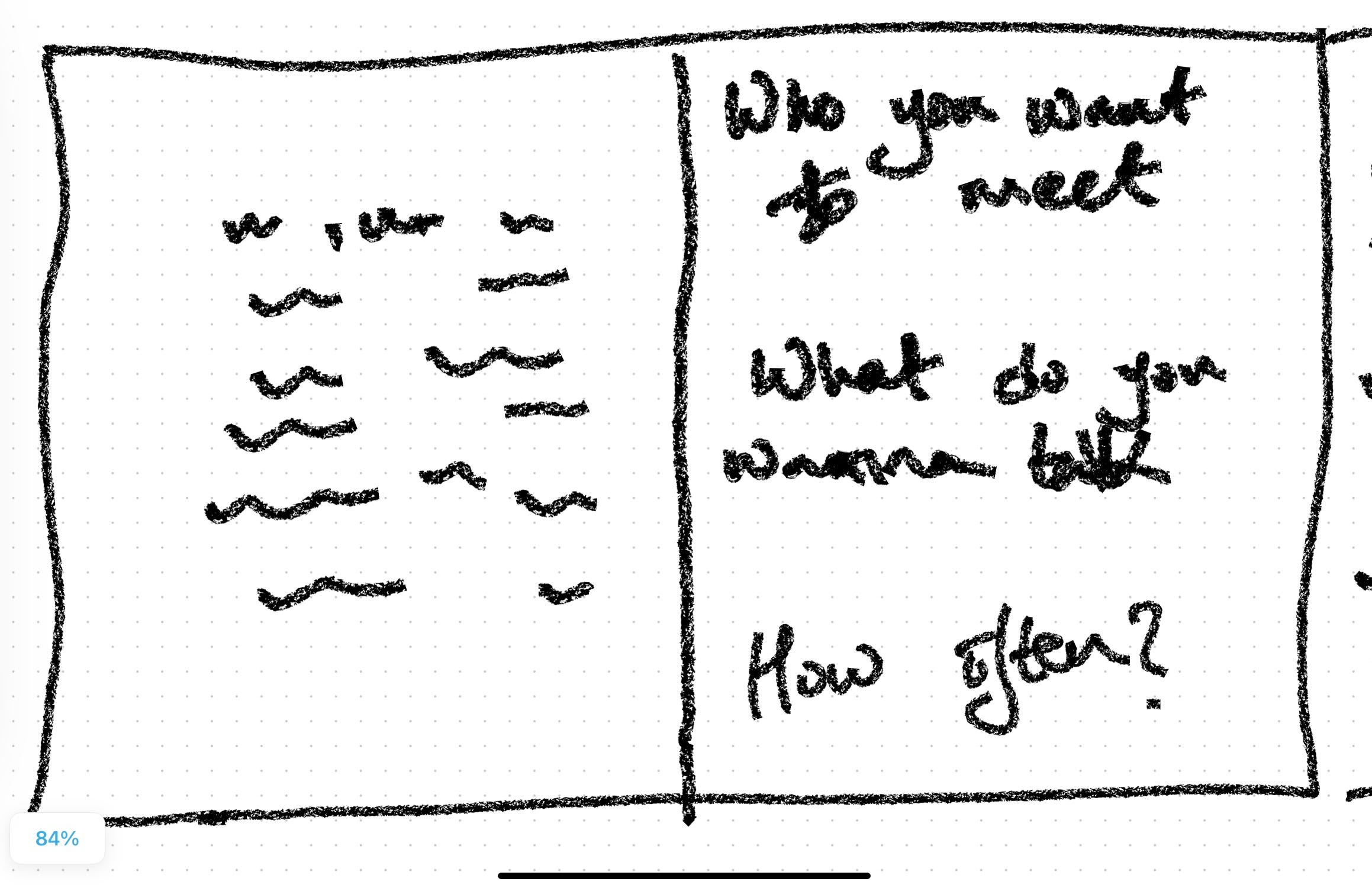
Verdict: This is extremely simple but powerful concept. It allowed me to quickly take something from an idea in my head to something physical that I was then able to share with my partner.
Next add some definition using a tool like Freeform (on iPad), Excalidraw or Miro
Once I was satisfied with my sharpie sketches, I wanted to add some definition to them and make them look closer to what they would look in reality.
You might think of using Figma to do this. It’s powerful, advanced and something used by professional designers. But it’s also complicated, distracting and confusing if you’re a beginner. I have seen a Figma board in livestreams and was absolutely scared of touching one.
So, I decided to use something that didn’t have a learning curve. I chose the Freeform app on my iPad. Here’s what the above sketch looks after I added some definition to it:
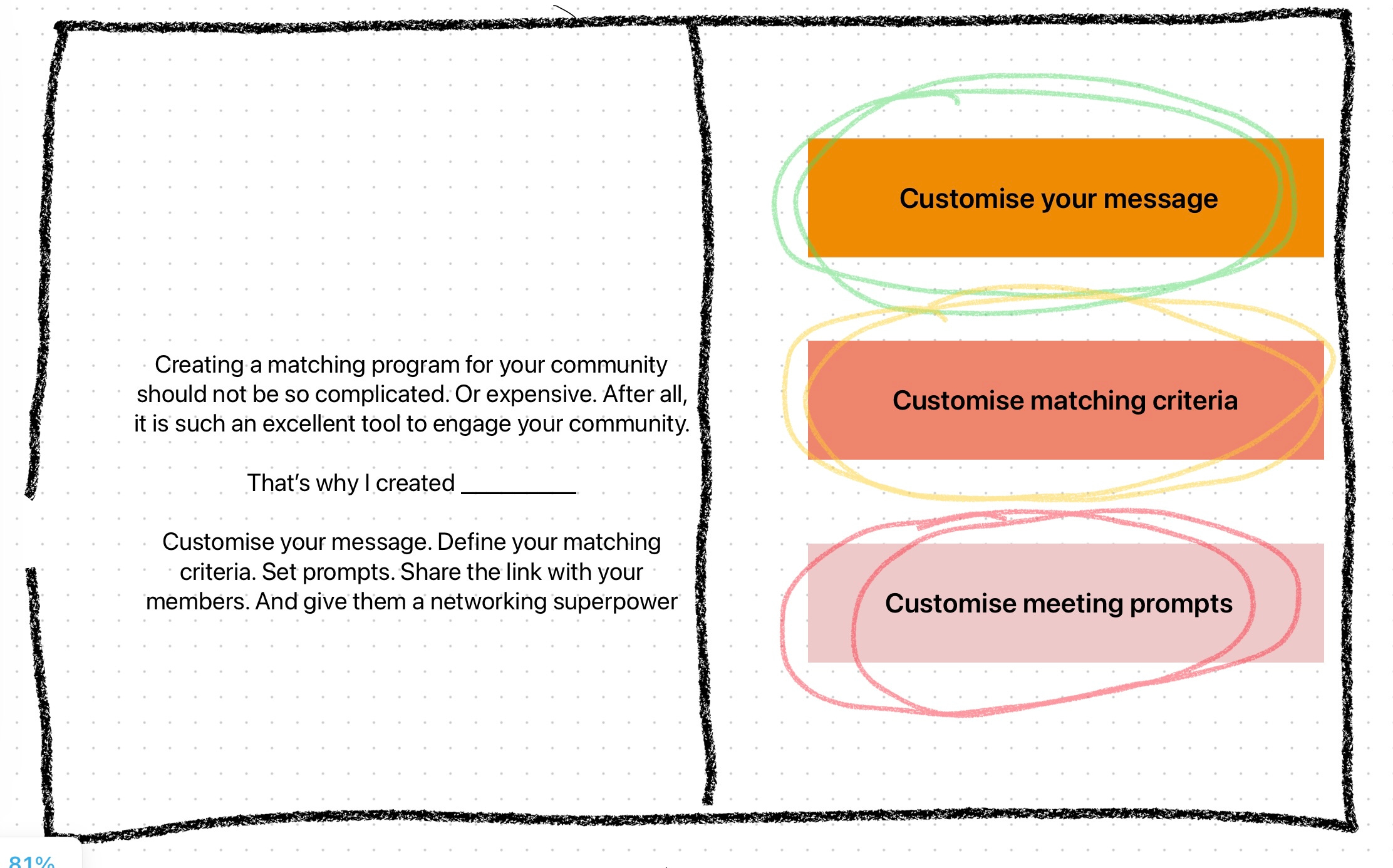
That was enough for me to start the work of putting this into code.
If you don’t want to use an iPad, Excalidraw and Miro are excellent free options.
Simple UI design tips that I picked and actually used
My entire knowledge of UI design comes from the following resources:
Refactoring UI book by the creators of Tailwind
Design Tips on Twitter again, by the creators of Tailwind
7 practical tips for cheating at design article by the creators of Tailwind
Steve Schoger’s redesign videos on Youtube (I could binge on this series!)
In fact, I haven’t even read the Refactoring UI book yet. I have only read the free chapters and a redesign demo included in the book. The other links above have so many practical design tips that I was able to make some very sensible style decision for my app.
TailwindCSS
Okay finally, we come to TailwindCSS.
Why did I decide to use Tailwind?
There are multiple technical reasons why using Tailwind CSS may be better for you. But as a new indie hacker, I didn’t care about them. Why?
I wouldn’t understand them. I’m a new developer.
I don’t really care about them. I care about building an MVP that solves a problem for users. I care about doing it fast. I care about building a business around it. But I don’t care if the tech that I’m using is the most superior as long as it helps me achieve first 3 goals.
So, how did I decide my tech stack? The same way I decided to use Rails for my project - DHH’s suggestion:
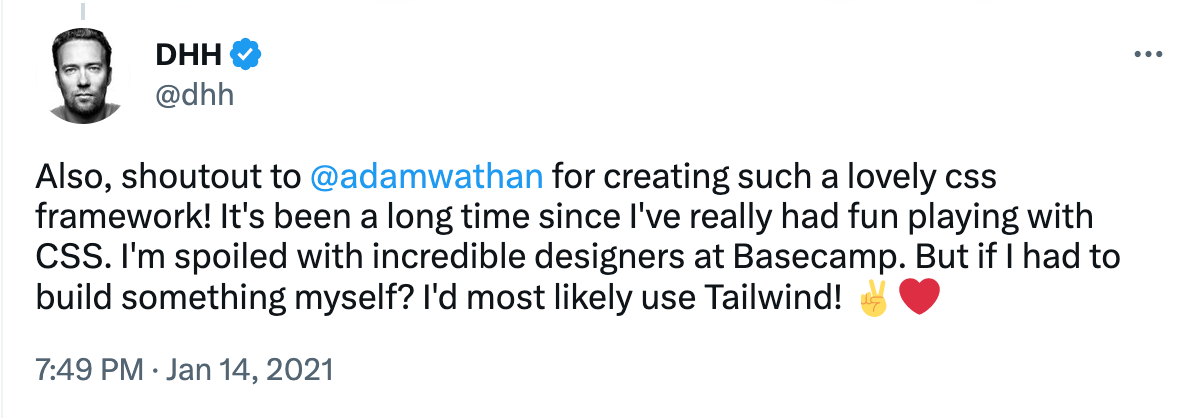
I believe in the concept of finding someone you trust and making a decision based on their opinion. And I know DHH is invested in creating the “one-person framework” that can allow a single developer to build a real-world application.
If you care for the technical reasons, read Adam Wathan’s article on why existing ways of writing CSS makes it hard to maintain down the line.
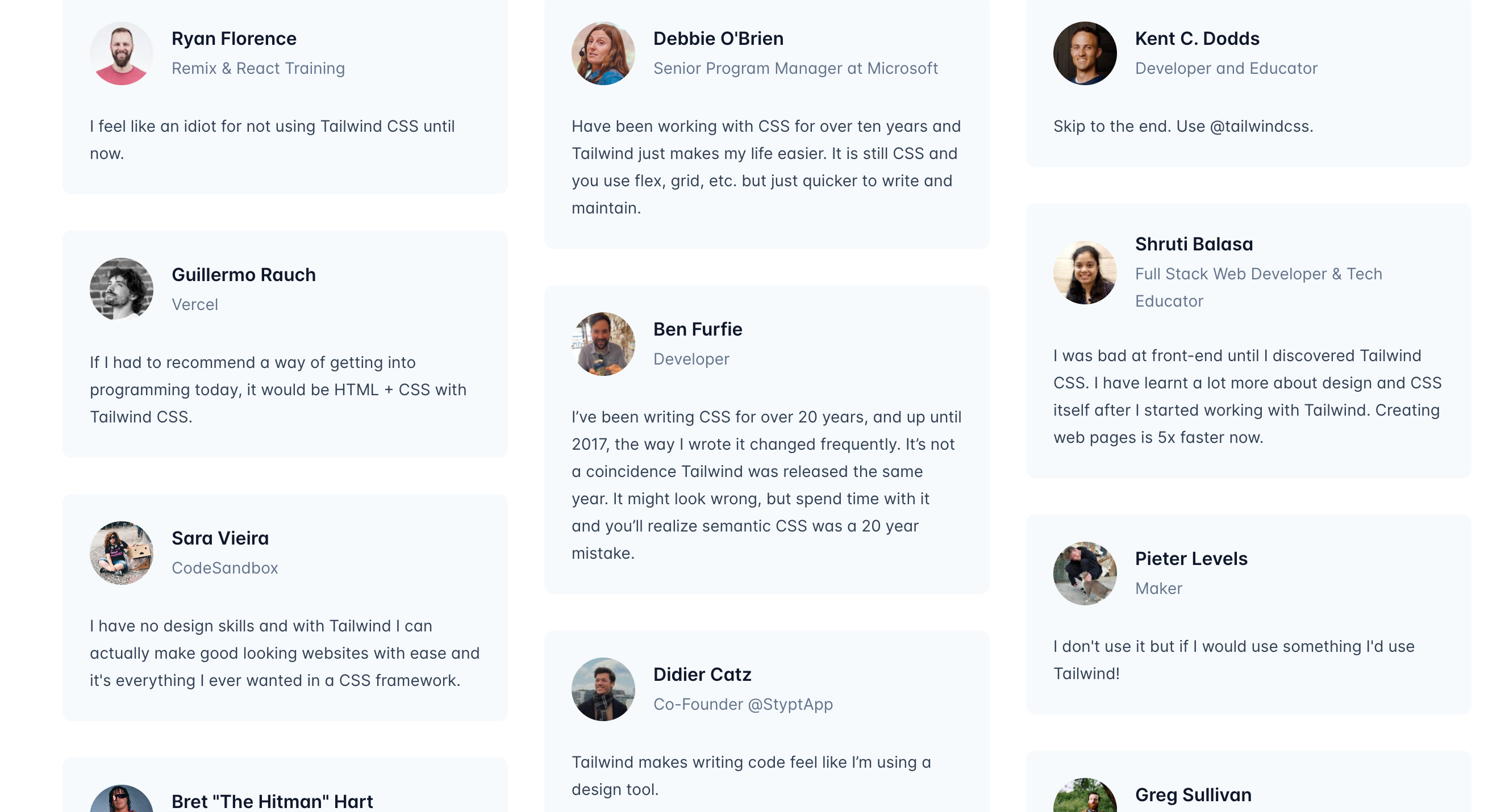
Also, Tailwind’s homepage itself is filled with testimonials of pro-developers who are singing praises of this framework.
All of these combined were enough for me to place a bet on using Tailwind for all my CSS needs.
What about learning CSS??
I say skip it. If you know HTML, you probably have a high-level understanding of what CSS is used for. That’s all you need to know because in Tailwind, you will be working with your HTML files most of the time anyway.
Do you understand, at a high level, what’s happening in the following CSS snippet?
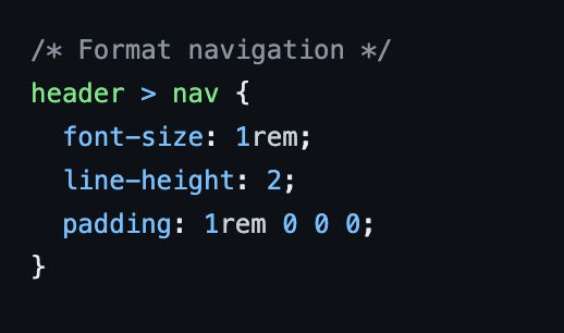
If yes, then I bet that you know enough CSS to start using Tailwind productively. Why?
Raw CSS is unconstrained. Meaning every attribute has every possible option. So as a new developer, you won’t understand which options you should choose. Tailwind makes you write good CSS by adding sensible constraints to the options you can choose from. Thus, it is easier if you start learning CSS with Tailwind itself.
Tailwind’s documentation of its CSS classes is easy to understand - even if you are a CSS beginner. Everything is explained with a lot of examples in a visual manner using examples that are easy to understand. This is how I was able to understand the concept of flexbox and grid - 2 of the most intimidating CSS concepts.
Adam Wathan’s Designing with Tailwind CSS series will show you how to style some of the common use cases with Tailwind CSS.
Finally, remember you have ChatGPT at your disposal. If you ever encounter a CSS snippet that you don’t understand or that you want to convert to Tailwind classes, just ask ChatGPT. It is great at this!
Basics of Tailwind you should know before you start
Okay, now that we have this out of the way, let me tell you about a few things that I believe will be super important for you to understand before you start using Tailwind.
The concept of utility-first
The homepage of Tailwind has this quote by Adam Wathan, one of the creators of Tailwind -
If you can suppress the urge to retch long enough to give it a chance, I really think you’ll wonder how you ever worked with CSS any other way.
The reason why he says this is because Tailwind makes your HTML go from looking like this -

To this -

The reason for this is Tailwind’s utility-first concept. This first article in Tailwind’s documentation covers this concept. It is a must-read accessible even to beginners like myself. But let me try to summarise the idea –
Traditionally, whenever you need to style something on the web, you write CSS. With Tailwind, you style elements by applying pre-existing classes directly in your HTML. This results in your html.erb files looking like the above.
At first glance, this may look messy but once you get accustomed to it, you realise how easy it is to work with CSS with this approach. I, for one, have always been afraid of touching CSS. So many settings, so many options and the cascading nature of the stylesheets - they felt so overwhelming. But Tailwind makes it all so simple.
As a new developer, I am happy that I never had to work with the older way of writing CSS. In fact, now, I wonder why HTML and CSS weren’t always fused this way before.
How Tailwind is mobile first by default
Tailwind CSS is mobile-first by default. Meaning that by any style you add is by default applied to all screen sizes - mobiles, tablets, laptops, big monitors and everything in between. Then, you need to use the prefixes like `sm`, `md`, `lg` etc to target screens above a specific size.
Check out this video in the Designing with Tailwind series I shared above and read this article to learn more about this approach.
Hover, focus and other states
Tailwind also comes with a bunch of other handy prefixes that allow you to conditionally apply some styles in particular situations - like when an element is being hovered upon, when it is focused and many more scenarios.
Check out this video in the Designing with Tailwind series I shared above and read this article to learn more about this approach.
Tailwind with Rails
DHH created a Tailwind gem for Rails which makes installing Tailwind to your Rails project as simple as adding tailwindcss-rails to your Gemfile and doing a bundle install. Here are the steps for it.
As a Rails developer, I found Tailwind was a beautiful complement to the MVC pattern used in the framework. Let me explain what I mean by that -
I tried using regular CSS in my app before I switched to Tailwind. This meant that my HTML was in my view files while the corresponding styling was in different CSS files scattered throughout the project. Sure, I could have done a better job of organising all that CSS but that would still leave me with a separate “styling” part of the app that I would have to deal with. The model-view-controller framework started feeling like the model-view-controller-styling framework.
But now, with Tailwind, all my styling information is in the view files itself. I have come to appreciate how Rails combines html with Ruby into the view files, giving us a html.erb file. With Tailwind, these view files become even more powerful. They are now essentially html.erb.css files because they contain styling information as well.
Finally, some random tips that made things easier for me:
Install VS code extension for Tailwind - it will give you hover previews of Tailwind classes.
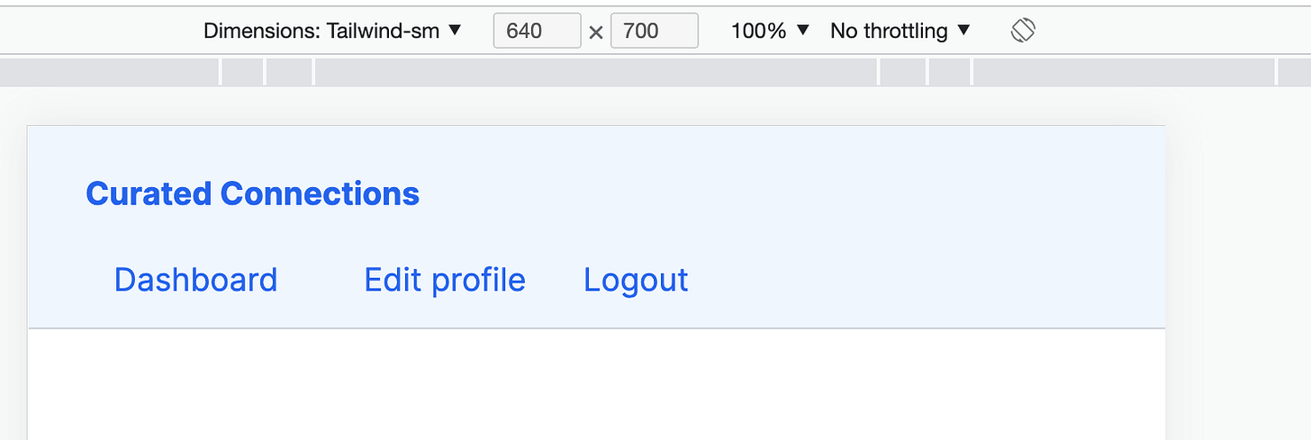
Add a new device in your browser’s developer console for “tailwind-sm” that is 640px wide and tailwind-md that is 768px wide. This is the pixel size for Tailwind’s `sm` and `md` breakpoint.
Learn to use your browser’s developer tools - especially how to see the margin and padding for each element. I was designing like a peasant until my girlfriend told me about this ubiquitous tool.

If you want to generate a color palette for your design system, I found this cool tool - tints.dev. It will generate a color palette that you can copy to your Tailwind library. Best part? The creator has applied the instructions that Tailwind’s creators have shared on creating a color palette in their book Refactoring UI.
I also discovered this cool library of Tailwind components - Daisy UI. I recently discovered it so haven’t got a chance to use it yet. But it is very popular and I can see it making it even faster for me to create beautiful frontend.
Final tip, you can give ChatGPT a CSS snippet and ask it to convert it to Tailwind using Tailwind’s classes. Comes very handy when you’re trying to copy the design from a traditional CSS framework.


That’s all! Now you are all set to create a beautiful UI for your own app using Rails and Tailwind.
What about React?
You don’t need it. DHH’s new Hotwire framework that allows you to create responsive single page applications using just Rails and no Javascript! It includes 3 sub-frameworks - Turbo, Stimulus and Strada. Checkout this tutorial to learn about Turbo, the official Stimulus handbook to learn about Stimulus and wait for Strada to be released in 2023!